How to Design a Challenge Coin That Tells a Clear Story
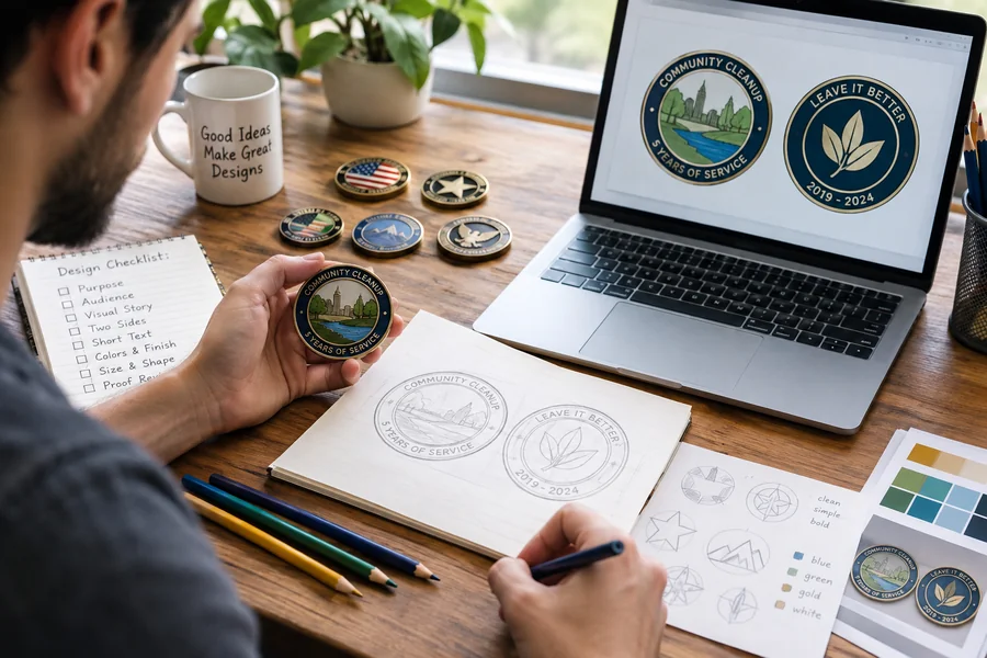
A well-designed challenge coin can honor service, celebrate a milestone, recognize a team, or preserve a shared memory in a form people can keep for years. The strongest results begin with a clear message, then use artwork, wording, texture, and color to support it. A challenge coin creator can help turn an early idea into a workable layout, but the planning stage should come first.
Because a coin has limited space, every element needs a job. Rather than treating the design as a place to fit every logo, date, and inside joke, focus on the one idea recipients should understand when they first hold it. That approach makes the finished piece easier to read, more personal, and more likely to remain meaningful over time.
Why Design Matters on a Challenge Coin
A challenge coin is small, so visual clarity matters. A strong central image gives the eye a place to land, while supporting details add context without competing for attention. The longstanding challenge coin tradition is closely associated with recognition and group identity, which makes a thoughtful design especially important.
For example, a rescue team might use a compass as its central symbol. It can suggest direction, readiness, service, and teamwork without requiring a long explanation. The surrounding text could name the team or mark the occasion, while smaller details could represent its location or specialty.
Start With the Coin’s Purpose
Before selecting colors or artwork, define the coin’s purpose. A retirement coin may call for a reflective, personal tone. A training graduation coin may emphasize achievement and forward progress. A community event coin may need a welcoming image tied to a place.
- Identify who will receive the coin.
- Define the event, group, achievement, or moment it represents.
- Choose one main feeling, such as pride, gratitude, courage, or unity.
- Write a one-sentence design brief.
- Remove details that do not strengthen that brief.
A useful design brief might be: “Create a coin that recognizes five years of service by showing the team’s mission, home region, and shared motto.” If an element does not help tell that story, it is probably not essential.
Choose Symbols With Meaning
Specific symbols usually feel more memorable than generic ones. A local ridge line, regional flower, familiar vehicle, piece of equipment, or building can connect the coin directly to the people who receive it. These details often make a design feel like it belongs to one group rather than any group.
Common images such as stars, shields, wings, ropes, mountains, and torches can still work well when they have a clear connection to the message. Consider what each symbol communicates, and check that it does not carry an unintended meaning in another cultural or organizational setting. Avoid copying protected logos or official emblems without permission.
Plan Both Sides Before Adding Details
The front and back should function as two parts of one story. Plan them together so the coin feels connected, even if each side has a different level of detail.
Front-Side Ideas
- A primary emblem, landmark, or central image
- The group name or a short title
- A border that frames the design without crowding it
- One clear focal point that remains recognizable at a small size
Back-Side Ideas
- A short motto or meaningful message
- An event date or location
- A secondary image or supporting symbol
- Intentional open space for a cleaner appearance
If the front includes a detailed scene, a quieter reverse side can create balance. The back does not need to repeat the same visual energy. It can provide room for the message that gives the front-side artwork its full meaning.
Use Text, Numbers, and Dates Wisely
Wording can make or break an otherwise strong design. Keep the main message short enough to read quickly, especially when it follows a curved edge. Use familiar words, limit the number of type styles, and avoid squeezing long phrases into narrow spaces.
- Confirm the spelling of every name, title, and location.
- Check dates against the intended event or service period.
- Verify abbreviations and rank titles with the appropriate recipient or organization.
- Read the text at the approximate final coin size.
- Consider initials or a shorter motto if the wording feels crowded.
Pick a Shape and Finish That Fit the Message
Shape and finish can reinforce the story when they are selected with purpose.
- Round coins create a familiar, balanced look.
- Shield shapes can suit themes of service, protection, or public safety.
- Badge-style shapes can complement an organization with an official identity.
- Custom silhouettes can highlight a landmark, object, or vehicle central to the design.
- Cutout details can add interest when they do not weaken readability.
Polished metal can create crisp highlights, while antique finishes can make raised and recessed details easier to distinguish. Selective color can draw attention to an emblem or key feature, but too many colors can distract from the main image. Always consider how the design will look without color as well.
Avoid Common Design Mistakes
- Trying to tell the entire history of a group on one small surface
- Using text that becomes difficult to read at final size
- Combining unrelated symbols without a shared theme
- Working from blurry or low-quality reference images
- Adding colors simply because they are available
- Skipping a final spelling, date, and placement review
- Choosing decorative trends that overpower the coin’s purpose
When a design feels crowded, remove one element at a time and reassess the focal point. Simplifying is not losing meaning. It is often the fastest way to make the intended meaning visible.
Follow a Simple Review Process
- Write the brief: State the purpose in one sentence.
- Gather references: Collect approved logos, colors, images, and wording.
- Create a rough layout: Place major elements before refining details.
- Test readability: View the art at the intended physical size.
- Ask for feedback: Show it to someone familiar with the group and someone seeing it for the first time.
- Check accuracy: Review every date, name, symbol, and abbreviation.
- Approve the final proof: Confirm that it matches the original message.
Outside feedback is valuable because the people closest to a project may understand references that other viewers miss. If a first-time viewer cannot quickly find the central idea, the layout may need more focus.
Common Questions About Challenge Coin Design
How Many Ideas Should a Coin Include?
One main theme usually produces the clearest result. Supporting details should explain or strengthen that theme rather than introduce unrelated ideas.
Should the Front and Back Match?
They should feel connected, but they do not need to look identical. Shared borders, colors, type styles, or symbols can create unity across both sides.
What Makes a Coin Feel Personal?
A meaningful location, a shared phrase, a relevant date, or a symbol known to the recipients can make the design feel personal without making it busy.
Is a Complex Design Always Better?
No. Detail helps only when it can be seen and understood. A simpler design can communicate more clearly and remain appealing long after the event has passed.
Final Thoughts
The best challenge coin designs tell one clear story. Begin with purpose, choose symbols that mean something to the recipients, keep wording readable, and review every detail before production. When each element supports the same message, a small metal coin can become a lasting reminder of service, achievement, place, and shared identity.

James is the creative mind behind worthelevate.com, with 4 years of experience writing hilarious puns, including food puns and animal puns. His witty articles add humor to everyday topics, making him a go-to for those seeking a fun twist on their favorite meals and animals.



Comments