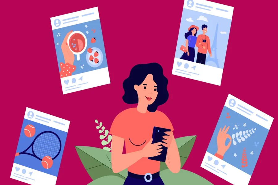
Social media is filled with colorful graphics, polished photographs, short videos, and carefully designed posts. With so much content competing for attention, simply publishing something attractive is not always enough. A distinctive visual style can help your posts become easier to recognize and give your audience a reason to pause while scrolling.
Creating a recognizable look does not mean making every post identical. Instead, it involves developing a collection of visual choices that work together. Colors, typography, imagery, layouts, and small design details can all contribute to a consistent identity while still leaving room for creativity. With a few practical adjustments, you can make your social posts feel more memorable and connected.
Develop a Consistent Visual Identity
One of the simplest ways to make social posts more distinctive is to establish a consistent visual identity. When people repeatedly see similar colors, fonts, and design elements, they can begin to associate those choices with your brand or personal content.
Start by selecting a small group of colors that you can use regularly. You might choose one primary color, one secondary color, and a neutral shade for backgrounds or supporting elements. This gives you enough flexibility to create variety without making every post feel unrelated.
Choose Fonts That Reflect Your Style
Typography can have just as much influence as color. A bold typeface may work well for energetic content, while a clean and simple font can create a more professional impression.
Try choosing one font for major headings and another complementary font for supporting text. Once you have found combinations that work, use them consistently across different types of posts. This makes your content easier to recognize even when the subject of each post changes.
Create Strong Visual Hierarchy
A social media post should communicate its main idea quickly. People often scroll through their feeds without stopping for long, so viewers should be able to understand the most important part of your message almost immediately.
Use size, spacing, contrast, and positioning to create a clear hierarchy. If you are promoting an upcoming event, for example, the event name and date should be more prominent than secondary information such as the location or registration details.
Avoid giving every element the same visual weight. When everything is large, bold, or brightly colored, nothing feels particularly important.
Experiment With Typography and Effects
Typography can also become a recognizable part of your social media style. Instead of always using plain text, consider how different treatments can make important words more visually interesting.
For creators who want to explore unusual lettering styles, AI text effects can help generate creative treatments that give headlines and key phrases a more distinctive appearance.
These effects should support the message rather than distract from it. A playful treatment may work well for a lifestyle brand, while a subtle effect could be more appropriate for a professional business account. The best choice depends on the personality you want your content to communicate.
Use Imagery With a Clear Point of View
Photography and illustrations can make your social posts more memorable, but the way you use them matters. Instead of selecting images simply because they look attractive, think about whether they contribute to a recognizable visual style.
For example, a food brand might consistently use close-up photography, natural lighting, and simple backgrounds. A travel creator could develop a style based on wide landscapes, warm tones, and candid moments. These choices create a visual pattern that followers can begin to associate with the account.
Give Your Images Consistent Treatment
You can also create consistency by applying similar editing choices to your photographs. This might involve using similar brightness levels, contrast, cropping styles, or color adjustments.
The goal is not to make every photograph look exactly the same. Instead, the images should feel like they belong to the same visual world when viewed together.
Make Better Use of Negative Space
Adding more elements does not necessarily make a social post more interesting. Sometimes, leaving space around an image or piece of text can create a much stronger result.
Negative space gives important elements room to breathe and makes the overall composition easier to understand. For example, a quote placed in the center of a simple background may attract more attention than the same quote surrounded by decorative graphics, icons, and photographs.
When designing a post, try removing one or two elements before publishing it. If the message becomes clearer, the simpler version may be the stronger design.
Create Reusable Design Patterns
Having a few reusable layouts can make it easier to maintain consistency without making your content repetitive. You could create different patterns for educational posts, announcements, quotes, product promotions, and customer stories.
For example, educational posts might use a large number or headline at the top, supporting information in the middle, and a small brand element at the bottom. Product posts could use a larger photograph with minimal text.
These patterns provide structure while still allowing you to change the content, imagery, and colors when appropriate.
Add Small Details That Become Recognizable
Distinctive design does not always come from major visual changes. Small recurring details can make your posts feel more personal and recognizable.
Consider using elements such as:
- A consistent corner shape or border
- A recurring icon style
- A unique way of presenting headlines
- A subtle logo placement
- A recognizable background pattern
For example, a creator might always place a small graphic symbol next to important tips. Over time, that simple detail can become part of the account’s visual identity.
Design for the Platform
A distinctive design still needs to work within the environment where it will appear. A layout that looks excellent on a desktop screen may not have the same impact on a mobile feed.
Keep important text large enough to read on smaller screens, and avoid placing essential information too close to the edges of the design. Think about how the post will look when someone sees it quickly while scrolling.
It is also worth considering the format of the content. A square graphic, vertical story, and short video may require different layouts, even when they share the same colors and branding.
Keep Creativity Balanced With Consistency
There is a natural tension between keeping your content consistent and trying new ideas. If every post looks identical, your feed may become predictable. If every post uses a completely different style, your audience may struggle to recognize your content.
A useful approach is to keep a few core elements consistent while allowing other parts of the design to change. Your colors and typography might remain familiar while your photography, composition, or decorative elements vary from post to post.
This creates a visual identity that feels recognizable without becoming repetitive.
Conclusion
Giving your social posts a distinctive look is less about following complicated design trends and more about making thoughtful, consistent choices. Develop a recognizable visual identity, create clear hierarchy, use imagery intentionally, and leave room for experimentation. With a balanced approach, your social content can become easier to recognize, more engaging to browse, and more reflective of your unique style.

James is the creative mind behind worthelevate.com, with 4 years of experience writing hilarious puns, including food puns and animal puns. His witty articles add humor to everyday topics, making him a go-to for those seeking a fun twist on their favorite meals and animals.